Usually there is a picture here of Mr. and Mr$. Bonddad's dogs. But Bonddad is writing this from his Iphone because BD is current at his new house getting it ready for the "big move". So -- there aren't any pictures, just a statement that it's the weekend and it's time to think about anything aside from the markets.
See you on Monday
Friday, May 30, 2008
Quarterly Banking Profile Roundup
The FDIC has released its Quarterly Banking Profile. Here are the salient points.
Let's break this down into smaller chunks of information.
Earnings were cut nearly in half because of the increased loan loss provisions.
Banks set aside nearly 4 times the amount of money for losses on a year over year basis. That can only mean one thing -- credit quality is seriously deteriorating.
Loan loss provisions are literally sucking the life out of the industry right now.
ROA has fallen in half over the last year.
And the problems mount:
Here are some graphs from the FDIC report.
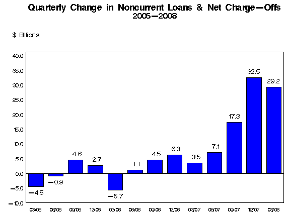
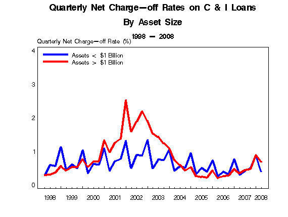
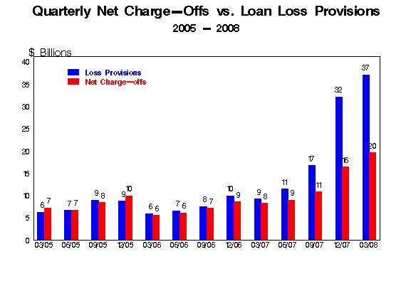
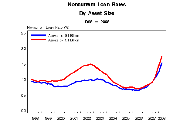
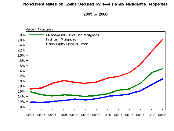
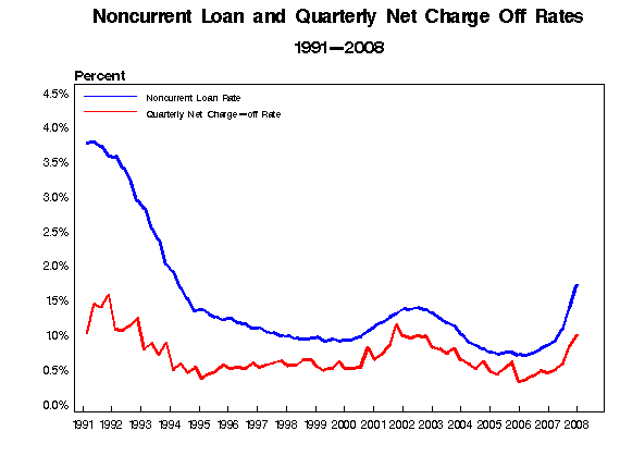
This report says one thing:
Deteriorating asset quality concentrated in real estate loan portfolios continued to take a toll on the earnings performance of many insured institutions in first quarter 2008. Higher loss provisions were the primary reason that industry earnings for the quarter totaled only $19.3 billion, compared to $35.6 billion a year earlier. FDIC-insured commercial banks and savings institutions set aside $37.1 billion in loan-loss provisions during the quarter, more than four times the $9.2 billion set aside in first quarter 2007. Provisions absorbed 24 percent of the industry's net operating revenue (net interest income plus total noninterest income) in the quarter, compared to only 6 percent in the first quarter of 2007. The average return on assets (ROA) was 0.59 percent, falling from 1.20 percent in first quarter 2007. The first quarter's ROA is the second-lowest since fourth quarter 1991. The downward trend in profitability was relatively broad: slightly more than half of all insured institutions (50.4 percent) reported year-over-year declines in quarterly earnings. However, the brunt of the earnings decline was borne by larger institutions. Almost two out of every three institutions with more than $10 billion in assets (62.4 percent) reported lower net income in the first quarter, and four large institutions accounted for more than half of the $16.3-billion decline in industry net income.
Let's break this down into smaller chunks of information.
Higher loss provisions were the primary reason that industry earnings for the quarter totaled only $19.3 billion, compared to $35.6 billion a year earlier
Earnings were cut nearly in half because of the increased loan loss provisions.
FDIC-insured commercial banks and savings institutions set aside $37.1 billion in loan-loss provisions during the quarter, more than four times the $9.2 billion set aside in first quarter 2007.
Banks set aside nearly 4 times the amount of money for losses on a year over year basis. That can only mean one thing -- credit quality is seriously deteriorating.
Provisions absorbed 24 percent of the industry's net operating revenue (net interest income plus total noninterest income) in the quarter, compared to only 6 percent in the first quarter of 2007.
Loan loss provisions are literally sucking the life out of the industry right now.
The average return on assets (ROA) was 0.59 percent, falling from 1.20 percent in first quarter 2007. he first quarter's ROA is the second-lowest since fourth quarter 1991
ROA has fallen in half over the last year.
And the problems mount:
Following restatements by banks, the FDIC revised the industry’s net income for the fourth quarter of last year from $5.8bn to $646m – the lowest since the end of 1990.
Meanwhile, the FDIC said the number of “problem” banks rose in the first quarter from 76 to 90, with combined assets of $26.3bn. Three US banks have failed this year, compared with three for the whole of last year and none in 2005 and 2006.
Ms Bair said she expected more bank failures but emphasised that the number of problem institutions remained well below the record levels of the savings and loan crisis of the 1980s and 1990s – when one in 10 banks were in that category.
However, she said one worrying trend was the declining “coverage ratio”, which compares bank reserves with the level of loans that are 90 days past due. This ratio fell for the eighth consecutive quarter, to 89 cents in reserves for every $1 of noncurrent loans, the lowest level since the first quarter of 1993.
Here are some graphs from the FDIC report.


This report says one thing:
“While we may be past the worst of the turmoil in financial markets, we’re still in the early stages of the traditional credit crisis you typically see during an economic downturn,” she said, adding: “What we really need to focus on is the uncertainty surrounding the economy . . . and again it is all about housing.”
Forex Fridays
Let's take a look at the charts of the three biggies -- the dollar, the euro and the yen.
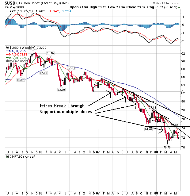
On the weekly dollar chart, notice that prices have been falling through support areas for the better part of two years. Also note the 20 and 50 week SMA are both heading lower, although the 10 day SMA is leveling out. Also note prices and the 10 day SMA are tangled up. But the 20 week SMA has privided strong upside resistance for the last year and a half.
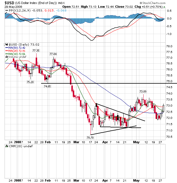
On the daily chart, notice the following:
-- Prices and the SMAs are bundled in a very tight range, indicating indecision.
-- The 50 week SMA is about to turn positive.
-- Prices have broken through all the SMAs and may be headed higher.
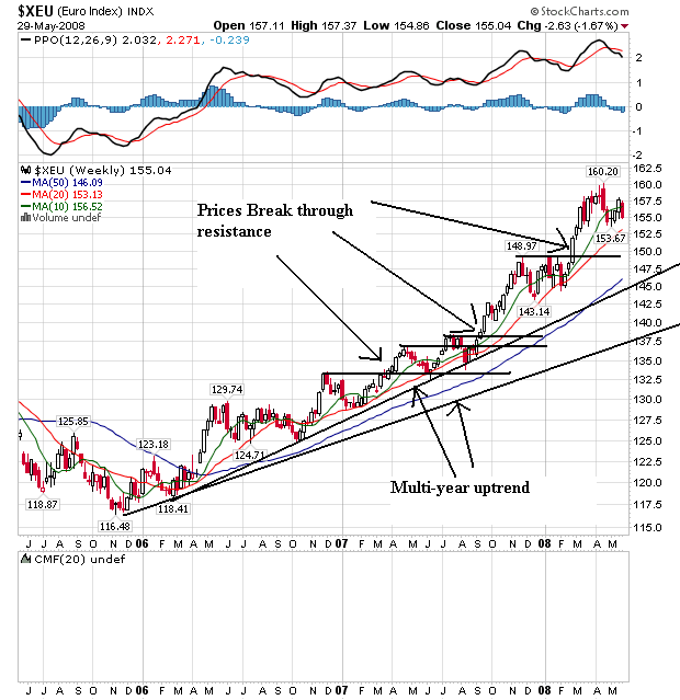
On the euro's weekly chart, notice it's the mirror image of the dollar chart. The euro has been rising for the better part of two years right now. Prices have continually broken through upside resistance to make new highs. Also notice the SMAs are all moving higher with the shorter SMAs above the longer. This is a bullish chart.
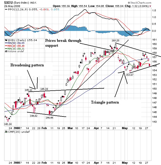
On the daily chart, notice the euro formed a broadened bottom from mid-January to the end of February, rallied until the end of April and has since been forming a triangle consolidation pattern. Also notice that prices and the SMAs are bunched together, indicating a lot of indecision on the part of traders regarding where to send the euro next.
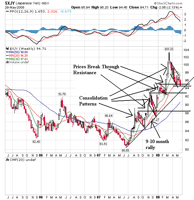
On the weekly yen chart, notice that prices have been sharply rising since the end of last summer. Prices moved through resistance on several occasions, but then fell back usually in pennant patterns. Note the 10 week SMAs has turned lower and is about to cross the 20 week SMA. Also note that prices are right below the 20 week SMA and recently fell through this important technical indicator.
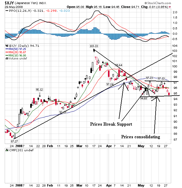
On the daily chart, notice that prices rallied from the beginning of the year until the beginning of April. Then prices fell until the beginning of May when they started to move sideways. Also notice that prices and the SMAs are bunched together right now, indicating a lack of direction.

On the weekly dollar chart, notice that prices have been falling through support areas for the better part of two years. Also note the 20 and 50 week SMA are both heading lower, although the 10 day SMA is leveling out. Also note prices and the 10 day SMA are tangled up. But the 20 week SMA has privided strong upside resistance for the last year and a half.

On the daily chart, notice the following:
-- Prices and the SMAs are bundled in a very tight range, indicating indecision.
-- The 50 week SMA is about to turn positive.
-- Prices have broken through all the SMAs and may be headed higher.

On the euro's weekly chart, notice it's the mirror image of the dollar chart. The euro has been rising for the better part of two years right now. Prices have continually broken through upside resistance to make new highs. Also notice the SMAs are all moving higher with the shorter SMAs above the longer. This is a bullish chart.

On the daily chart, notice the euro formed a broadened bottom from mid-January to the end of February, rallied until the end of April and has since been forming a triangle consolidation pattern. Also notice that prices and the SMAs are bunched together, indicating a lot of indecision on the part of traders regarding where to send the euro next.

On the weekly yen chart, notice that prices have been sharply rising since the end of last summer. Prices moved through resistance on several occasions, but then fell back usually in pennant patterns. Note the 10 week SMAs has turned lower and is about to cross the 20 week SMA. Also note that prices are right below the 20 week SMA and recently fell through this important technical indicator.

On the daily chart, notice that prices rallied from the beginning of the year until the beginning of April. Then prices fell until the beginning of May when they started to move sideways. Also notice that prices and the SMAs are bunched together right now, indicating a lack of direction.
Thursday, May 29, 2008
Today's Markets
Two big pieces of good news today. Oil dropped more than $4 (when was the last time I wrote that. In addition, the economy grew at a .9% clip in the first quarter, which was slightly higher than originally reported. But consumers only increased their spending at a 1% rate which is not that encouraging. The FDIC released the Quarterly Banking Profile, which was not that good.
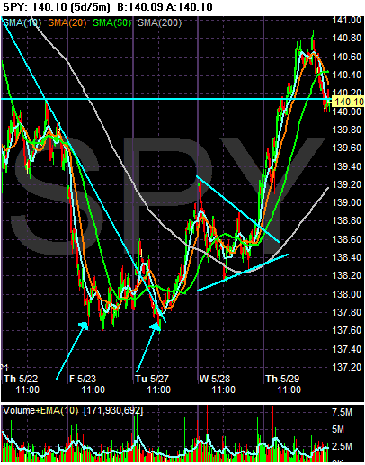
On the SPYs, notice the double bottom that formed on Friday and Tuesday. The market rose a touch from this formation, consolidated in a triangle pattern on Wednesday and then rallied hard today on the GDP and oil news. Also note the SPYs ended the session right at technical support levels.
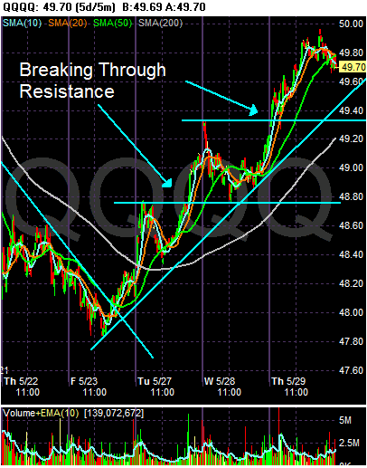
On the QQQQs, notice there is a much better chart in play. The market has been rising and then consolidating gains since Friday of last week.
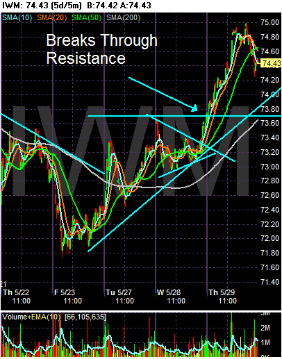
The IWMs are more in the line of the SPYs, largely because of their triangle consolidation a few days ago.

On the SPYs, notice the double bottom that formed on Friday and Tuesday. The market rose a touch from this formation, consolidated in a triangle pattern on Wednesday and then rallied hard today on the GDP and oil news. Also note the SPYs ended the session right at technical support levels.

On the QQQQs, notice there is a much better chart in play. The market has been rising and then consolidating gains since Friday of last week.

The IWMs are more in the line of the SPYs, largely because of their triangle consolidation a few days ago.
It's the Debt, Stupid
One of the first trends I noticed with the latest US expansion is the record amount of debt that was involved. Simply put -- this was a borrow and spend expansion like nobody's business. I'm not the only one who has noticed:
Let's look at a few charts to see what we're talking about.
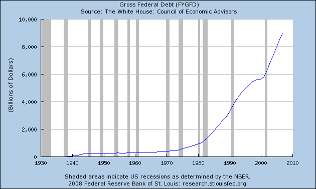
Total federal debt is huge.
Consider the following numbers from the Bureau of Public Debt:
09/30/2007 $9,007,653,372,262.48
09/30/2006 $8,506,973,899,215.23
09/30/2005 $7,932,709,661,723.50
09/30/2004 $7,379,052,696,330.32
09/30/2003 $6,783,231,062,743.62
09/30/2002 $6,228,235,965,597.16
09/30/2001 $5,807,463,412,200.06
09/30/2000 $5,674,178,209,886.86
The current total is $9,393,275,739,477.56
The the government isn't the only one borrowing.
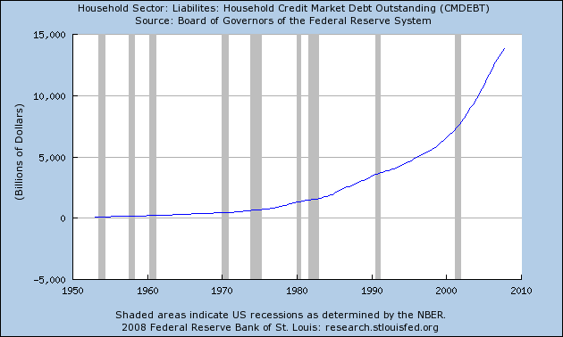
Total household debt is spiking, leading to
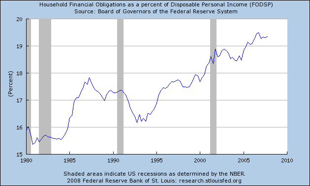
An increase in the household financial obligations ratio.
This has led to the following chart, which is from the original story above:
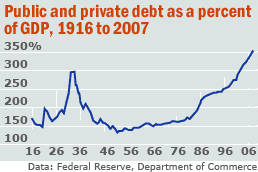
That can't be good.
Is Kevin Phillips right that something funny is going on in the economy? Yes, although just how funny is less clear.
The numbers do suggest he's correct about one thing at least: public and private debt has indeed reached unprecedented levels.
Recently, we described Phillips' thesis, in his new book "Bad Money: Reckless
Finance, Failed Politics, and the Global Finance of American Capital" that the U.S. economy has been run by a Washington-Wall Street mercantilist alliance for the benefit of the finance sector. See column.
Phillips doesn't flat-out predict that the resulting distortions will result in a crash. He says it's too early to say. But he meaningfully quotes a number of authorities, such as Yale economist Robert Shiller, to the effect that it will.
Phillips relies heavily on charts, which we like.
In this column, we look at one that is at the heart of his book: public and private debt as a fraction of Gross Domestic Product.
It looks like a barbell, with peak debt of 299% in 1933 falling to below 150% from the 1950-1980s, spiking again to a recent 353%. We've checked the numbers -- updating them to 2007 -- and he's right.
Let's look at a few charts to see what we're talking about.

Total federal debt is huge.
Consider the following numbers from the Bureau of Public Debt:
09/30/2007 $9,007,653,372,262.48
09/30/2006 $8,506,973,899,215.23
09/30/2005 $7,932,709,661,723.50
09/30/2004 $7,379,052,696,330.32
09/30/2003 $6,783,231,062,743.62
09/30/2002 $6,228,235,965,597.16
09/30/2001 $5,807,463,412,200.06
09/30/2000 $5,674,178,209,886.86
The current total is $9,393,275,739,477.56
The the government isn't the only one borrowing.

Total household debt is spiking, leading to

An increase in the household financial obligations ratio.
This has led to the following chart, which is from the original story above:

That can't be good.
Sorting Out All the Spin in Durable Goods
There are times when I could literally just scream at the incredible amount of political bullshit that goes on with economic numbers. It just boggles the mind and frustrates the analysis. So, instead of relying on the news media to inform us, we are now faced with the task of sorting through the noise. What fun indeed.
According to the Census Bureau:
This is where the first issue comes in. Notice we have the "ex-transportation factor" to deal with. Transportation orders represent about 25% of the durable goods numbers. In addition, transportation orders are very volatile. For example, suppose Boeing gets an order for 25 planes in a particular month. That would spike the overall numbers really high. But that reading would be a bit unrealistic as well because who knows when Boeing would get another order. So -- we usually get the numbers with and without the transportation variable.
What everyone is thrilled about is the ex-transportation number of +2.5%. That made everyone thrilled. But buried in the news headline is this information:
Given that piece of information, it's just as likely that the increase was a one time event that occurred as overall orders were going down rather than up. At best, the most we can hope for with that piece of information is to wait until next month to see if the upward trend continues.
And then there is this:
So -- the jump is from a few specific areas of the report, not an overall jump in all or a majority of orders. That should tell us something. Reuters adds the following to that number:
So -- overseas orders are probably responsible. This has been a good story for the US economy over the last half-year or so -- the increase in exports.
So, let's put all of these facts together to see what we come up with.
In addition, let's look at the general business background to see if all of this excitement about one number is warranted:
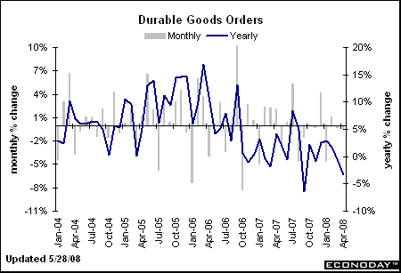
First -- the year-over-year change in durable goods is negative.
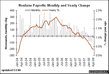
Companies are doing so well they are shedding workers, and
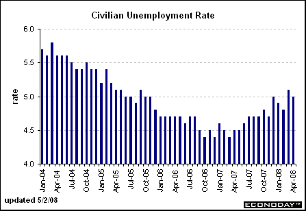
The unemployment rate is increasing
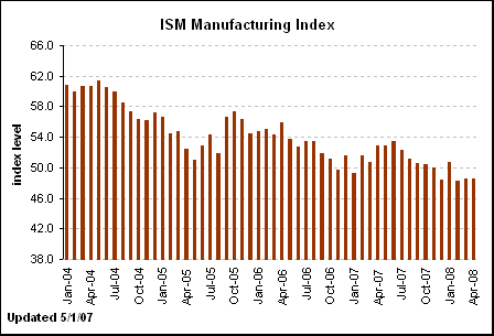
The ISM manufacturing number is below 50 and has been there a few months. This indicates we're in a contraction.
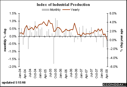
industrial production is dropping, as is
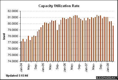
Capacity utilization
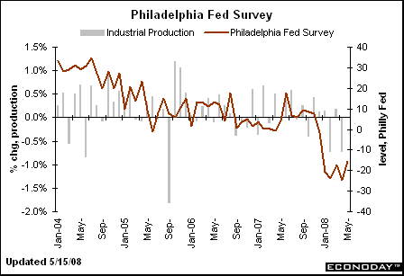
The Philly Fed is not doing as, and neither is the
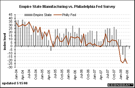
Empire state survey
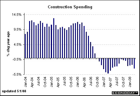
Construction spending is weak, as are
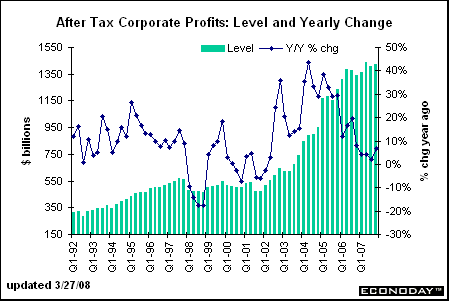
After tax corporate profits.
All of the above information says the number was a fluke and not the beginning of a trend. That could change. However, the great weight of the available evidence says no.
According to the Census Bureau:
New orders for manufactured durable goods in April decreased $1.0 billion or 0.5 percent to $214.4 billion, the U.S. Census Bureau announced today. This was the third decrease in four months and followed a 0.3 percent March decrease. Excluding transportation, new orders increased 2.5 percent. Excluding defense, new orders decreased 0.3 percent.
This is where the first issue comes in. Notice we have the "ex-transportation factor" to deal with. Transportation orders represent about 25% of the durable goods numbers. In addition, transportation orders are very volatile. For example, suppose Boeing gets an order for 25 planes in a particular month. That would spike the overall numbers really high. But that reading would be a bit unrealistic as well because who knows when Boeing would get another order. So -- we usually get the numbers with and without the transportation variable.
What everyone is thrilled about is the ex-transportation number of +2.5%. That made everyone thrilled. But buried in the news headline is this information:
The 4.2% increase in nondefense capital goods excluding aircraft followed three monthly declines in a row. Analysts pointed to export markets, a source of strength for the U.S. with domestic demand weakening.
Given that piece of information, it's just as likely that the increase was a one time event that occurred as overall orders were going down rather than up. At best, the most we can hope for with that piece of information is to wait until next month to see if the upward trend continues.
And then there is this:
Orders rose 4.2% for machinery, 2.8% for primary metals and a record 27.8% for electrical equipment. Orders fell 1.3% for fabricated metals and 1.5% for computers and electronics.
The concentration of strength in orders for electrical equipment prompted Goldman Sachs economists to express some caution "against ascribing too much significance to this report."
So -- the jump is from a few specific areas of the report, not an overall jump in all or a majority of orders. That should tell us something. Reuters adds the following to that number:
However, electrical equipment orders surged 27.8 percent, the steepest increase on record, which analysts attributed to strong overseas demand that has been driven by a weak U.S. dollar. Machinery and primary metals orders also rose.
"The strength of global demand has greatly dampened the extent of the slowdown in manufacturing production, and in the light of today's orders numbers, it will continue to do so," said Nigel Gault, chief U.S. economist at Global Insight.
So -- overseas orders are probably responsible. This has been a good story for the US economy over the last half-year or so -- the increase in exports.
So, let's put all of these facts together to see what we come up with.
Durable goods orders ex-transportation increased 2.5% last month. This was the only increase in this figure in the last four months. Increases in machinery, precious metals and electrical equipment were responsible for the increase in the ex-transportation numbers. The most likely reason for the increase is the long-term downward trend of the dollar which makes US exports cheaper overseas.
Some analysts cautioned not to read too much into this increase because of the small number of areas in the report that contributed to the increase.
In addition, let's look at the general business background to see if all of this excitement about one number is warranted:

First -- the year-over-year change in durable goods is negative.

Companies are doing so well they are shedding workers, and

The unemployment rate is increasing

The ISM manufacturing number is below 50 and has been there a few months. This indicates we're in a contraction.

industrial production is dropping, as is

Capacity utilization

The Philly Fed is not doing as, and neither is the

Empire state survey

Construction spending is weak, as are

After tax corporate profits.
All of the above information says the number was a fluke and not the beginning of a trend. That could change. However, the great weight of the available evidence says no.
Oil Market Roundup
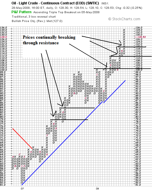
On the P&F chart, notice one clear point: prices have continually made new highs by breaking through key areas of resistance. Also note this have been going on for some time.
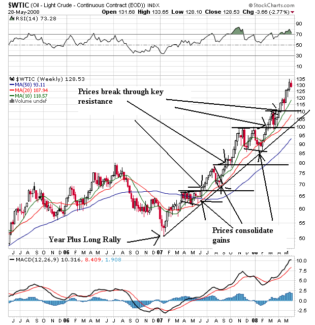
On the weekly chart, notice the following:
-- Prices have continually made new highs
-- Prices have always consolidated gains
-- Prices are above all the SMAs
-- All the SMAs are headed higher
-- The shorter SMAs are higher than the longer SMAs
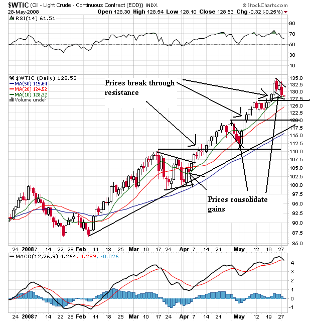
On the daily chart notice the following:
-- Prices have continually made new highs
-- Prices have always consolidated gains
-- Prices are above all the SMAs
-- All the SMAs are headed higher
-- The shorter SMAs are higher than the longer SMAs
Notice that the points for the weekly chart all apply to the daily charts. Simply put, both charts are extremely bullish.
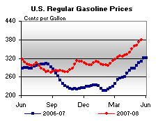
Also note the gas prices are still higher than this time last year:
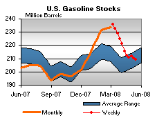
And gas stockpiles are dropping:
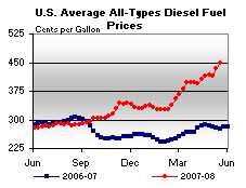
Also note the diesel gas is very high:
And gas prices are still hitting highs:
The U.S. average retail price for regular gasoline climbed to another all-time high, going up 6.9 cents to 379.1 cents per gallon. This was the eighth consecutive week for the national average price to increase, with the cumulative change totaling 53.2 cents. All regions recorded price hikes, with the East Coast jumping by 8.2 cents (the most of any region) to 379.5 cents per gallon. The average price in Central Atlantic portion of the East Coast surged up by 9.5 cents to 382.4 cents per gallon, 74.2 cents above the price a year ago. The average price in the Midwest went up 6.3 cents to 379.9 cents per gallon. The average price in the Gulf Coast region was 368.9 cents per gallon, a jump of 7.3 cents. Increasing by 7.7 cents to 368.6 cents per gallon, the price in the Rocky Mountain region remained the lowest in the country but only by a mere three-tenths of a cent. Once again, the average price for the West Coast was the highest in the nation, moving up by 5 cents to 388.3 cents per gallon. The average price in California rose by 3.3 cents to 395.2 cents per gallon.
Wednesday, May 28, 2008
Today's Markets
I'm on a PF kick today -- and will be using them more often going forward. I like the way they get rid of all the noise and just look at price action. So -- let's see what the PF charts say about all three averages.
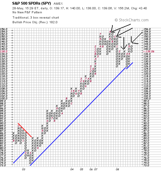
On the SPYs notice there are two possible interpretations. First, we have a series of lower highs -- which could indicate we're heading lower. However, there is an intermittent high -- the third peak -- that could be the beginning of another round of increasing highs. Also note that prices broke the trend line started in 2003, which lends credence to the argument that we're moving lower.
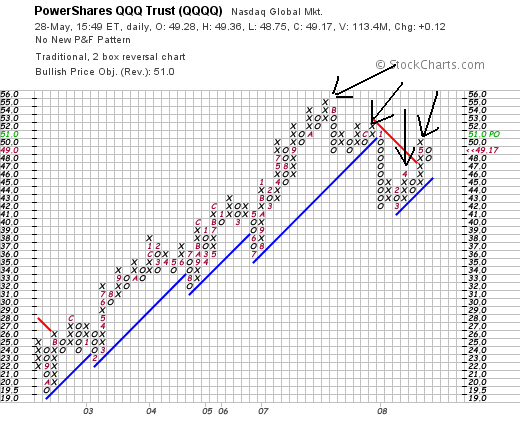
On the QQQQs note we have the same technical issues as with the SPYs -- that it's possible we're entering a new rally or are in a period of lower highs. However, also notice the big sell-off that started at the beginning of 2008 and the fact that that sell-off broke a trend line. That should tell you we're in a downward move overall right now.
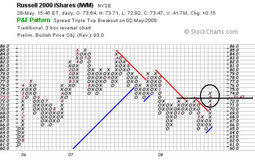
What's interesting with the IWMs is that while they were falling since mid-2007 they have clearly broken higher in the latest rally. Also note they had a hard time breaking the 72 level, but eventually got there.

On the SPYs notice there are two possible interpretations. First, we have a series of lower highs -- which could indicate we're heading lower. However, there is an intermittent high -- the third peak -- that could be the beginning of another round of increasing highs. Also note that prices broke the trend line started in 2003, which lends credence to the argument that we're moving lower.

On the QQQQs note we have the same technical issues as with the SPYs -- that it's possible we're entering a new rally or are in a period of lower highs. However, also notice the big sell-off that started at the beginning of 2008 and the fact that that sell-off broke a trend line. That should tell you we're in a downward move overall right now.

What's interesting with the IWMs is that while they were falling since mid-2007 they have clearly broken higher in the latest rally. Also note they had a hard time breaking the 72 level, but eventually got there.
Wednesday's Commodities Roundup
I'm going to do something different today. I'm going to use Point and Figure charts (PF) charts for the commodities markets. There are a few reasons for this. First, they are a great way to filter out the noise in the markets and see exactly what prices are doing. Secondly, there are some really interesting divergences in the commodities market right now that PF charts really highlight.
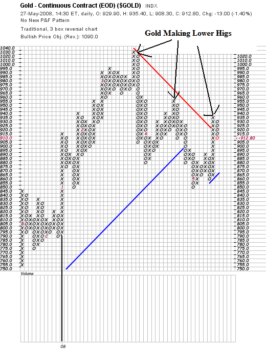
Let's start with the Gold PF chart. Notice the following:
-- The black vertical line at the left is the beginning of 2008. Notice that prices have moved a ton since then. That means there's a lot of volatility in the market fight now.
-- Notice that prices have made a three lower highs. Assuming the gold is a proxy for future inflation expectations, that means investors are looking ahead and thinking prices will eventually come down.
I mention the last point because I've had a long-running email debate going with New Deal Democrat over at Economic Populist. He and I have a bet about end of the year inflation. I think 2008 inflation will be higher and he thinks it will be lower. This signals that inflation may be coming down.
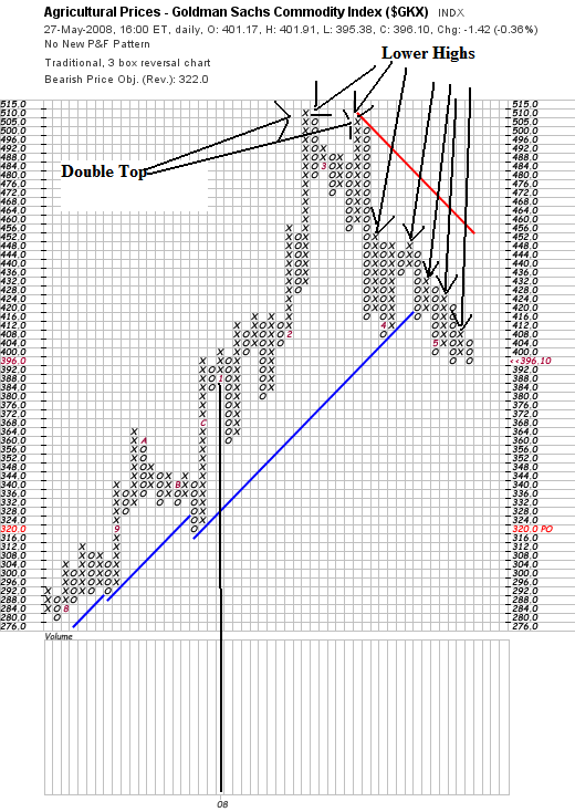
Here is a PF of agricultural prices. This is an area of commodities that I have been concerned about as being inflationary. Well, it looks as though some of those prices are coming down as well.
Notice the pattern of lower highs. That's good news for the coming months.
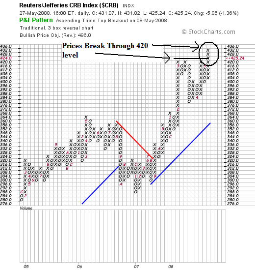
But here is a chart that runs counter to the "inflation is going lower" argument. Overall the CRB is still rising. Notice that prices recently broke through key resistance.
The reason for the continued increase in the CRB is oil, which I'll over tomorrow.

Let's start with the Gold PF chart. Notice the following:
-- The black vertical line at the left is the beginning of 2008. Notice that prices have moved a ton since then. That means there's a lot of volatility in the market fight now.
-- Notice that prices have made a three lower highs. Assuming the gold is a proxy for future inflation expectations, that means investors are looking ahead and thinking prices will eventually come down.
I mention the last point because I've had a long-running email debate going with New Deal Democrat over at Economic Populist. He and I have a bet about end of the year inflation. I think 2008 inflation will be higher and he thinks it will be lower. This signals that inflation may be coming down.

Here is a PF of agricultural prices. This is an area of commodities that I have been concerned about as being inflationary. Well, it looks as though some of those prices are coming down as well.
Notice the pattern of lower highs. That's good news for the coming months.

But here is a chart that runs counter to the "inflation is going lower" argument. Overall the CRB is still rising. Notice that prices recently broke through key resistance.
The reason for the continued increase in the CRB is oil, which I'll over tomorrow.
Anatomy of Mortgage Fraud
From the WSJ:
These are standard securitization provisions. What they essentially say is "if the loan I purchase goes bad really quickly, you'll buy it back." The fact that no one has thought to aggressively use these provisions before is interesting. I guess loan purchasers thought that securitization would parse the risk into so many tranches that it would go away. Oops.
When Freddie and Fannie start doing this, everyone will. Freddie and Fannie are responsible for the largest portion of the mortgage market, so they set the "industry standard." Again -- shouldn't they have been doing this before to save the taxpayers money?
I've been really critical of the rating agencies throughout this scandal. In fact, my disdain has only grown. It's obvious from the above statement that the ratings agencies haven't done anything remotely close to meaningful due diligence on anything they've rated during the last cycle.
And on a related noted, the ratings agencies are now looking for internal sacrificial lambs:
Expect a bunch of middle-level managers who were only following orders from senior executives to get fired for this. I also wouldn't be surprised if a few of them left some really incriminating paper trails like emails stating, "what you're asking me to do is wrong."
And here's a surprise -- the biggest problems appear to be coming from .... Countrywide Financial:
Maybe that's why there's a criminal investigation of Countrywide going on:
When we look back on this entire event we're going to see a glaring problem: when no one is enforcing the rules they get broken.
Already burned by bad mortgages on their books, lenders now are feeling rising heat from loans they sold to investors.
Unhappy buyers of subprime mortgages, home-equity loans and other real-estate loans are trying to force banks and mortgage companies to repurchase a growing pile of troubled loans. The pressure is the result of provisions in many loan sales that require lenders to take back loans that default unusually fast or contained mistakes or fraud.
These are standard securitization provisions. What they essentially say is "if the loan I purchase goes bad really quickly, you'll buy it back." The fact that no one has thought to aggressively use these provisions before is interesting. I guess loan purchasers thought that securitization would parse the risk into so many tranches that it would go away. Oops.
Repurchase demands are coming from a wide variety of loan buyers. In a recent conference call with analysts, Fannie Mae said it is reviewing every loan that defaults -- and seeking to force lenders to buy back loans that failed to meet promised quality standards. Freddie Mac also has seen an increase in such claims, a spokeswoman says, adding that most are resolved easily.
When Freddie and Fannie start doing this, everyone will. Freddie and Fannie are responsible for the largest portion of the mortgage market, so they set the "industry standard." Again -- shouldn't they have been doing this before to save the taxpayers money?
Additional pressure is coming from bond insurers such as Ambac Financial Group Inc. and MBIA Inc., which guaranteed investment-grade securities backed by pools of home-equity loans and lines of credit. In January, Armonk, N.Y.-based MBIA began working with forensic experts to scrutinize pools it insured that contained home-equity loans and credit lines to borrowers with good credit. "There are a significant number of loans that should not have been in these pools to begin with," says Mitch Sonkin, MBIA's head of insured portfolio management.
I've been really critical of the rating agencies throughout this scandal. In fact, my disdain has only grown. It's obvious from the above statement that the ratings agencies haven't done anything remotely close to meaningful due diligence on anything they've rated during the last cycle.
And on a related noted, the ratings agencies are now looking for internal sacrificial lambs:
Moody's Corp. employees may be fired if the firm finds that errors in calculating credit ratings for certain products were covered up, people familiar with the matter said, marking a turn away from the firm's more-defensive stance for months.
Moody's had been saying it did nothing wrong in its rating business during the last few years, despite dramatically lowering many of the ratings on the securities it tracked.
The firm's heightening internal investigation, which may conclude by next month, comes as the Securities and Exchange Commission widens its own probe into rating-firm conduct. The SEC is focused chiefly on how Moody's Investors Service, McGraw-Hill Cos.' Standard & Poor's unit and Fimalac SA's Fitch Ratings rated billions of dollars in mortgage-related securities.
Expect a bunch of middle-level managers who were only following orders from senior executives to get fired for this. I also wouldn't be surprised if a few of them left some really incriminating paper trails like emails stating, "what you're asking me to do is wrong."
And here's a surprise -- the biggest problems appear to be coming from .... Countrywide Financial:
Countrywide Financial Corp., the largest mortgage lender in the U.S., said in a securities filing this month that its estimated liability for such claims climbed to $935 million as of March 31 from $365 million a year earlier. Countrywide also took a first-quarter charge of $133 million for claims that already have been paid.
Maybe that's why there's a criminal investigation of Countrywide going on:
The Federal Bureau of Investigation and the criminal division of the Internal Revenue Service have formed a task force to examine mortgages that were made with little or no proof of the earnings or assets of borrowers, a government official who had been briefed on the matter said Sunday.
.....
In March, the Justice Department and the F.B.I. began investigating whether the Countrywide Financial Corporation, the troubled mortgage giant, misrepresented its financial condition and loans in filings with the Securities and Exchange Commission.
Countrywide is also under scrutiny by California and Illinois; federal prosecutors in Sacramento; and the United States Trustee, the federal agency that monitors bankruptcy courts. The S.E.C., meanwhile, is examining stock sales by certain Countrywide executives.
When we look back on this entire event we're going to see a glaring problem: when no one is enforcing the rules they get broken.
Treasury Market Roundup
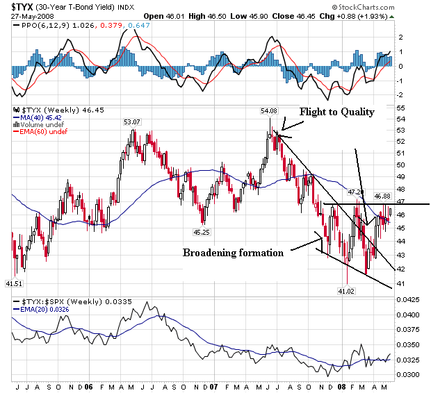
On the weekly 30-year yield chart, notice that yields are in a broadening pattern, moving between 4.20% and 4.60%. Also notice the yields have broken through resistance that started with the flight to quality at the end of last summer. The question now is will yields go higher or stay in this area.
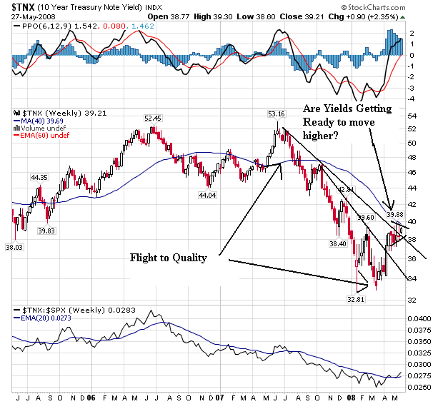
Notice the exact same situation with the 10-year -- that yields have broken through resistance that started at the end of last summer with the flight to quality. As with the 30-year, the question now is where will yields go from here.
Inflation is starting to take a toll on investors attitudes about government debt:
Inflation worries driven mainly by surging oil prices mean government-bond markets across the developed world may be in for a rough period.
Bonds are being weighed down by views that rising price pressures mean not just a halt to interest-rate cuts in the U.S. and the U.K. Concerns also are emerging that price pressures could force the Federal Reserve and the European Central Bank to raise borrowing costs later this year.
To be sure, the recent heavy selloff that has pushed yields higher may attract bargain-hunting investors. Disappointing economic data may also encourage some buying. But a more consistently upbeat tone may not be found until later this year, when growth might slow to a point that will push inflation worries to the back burner.
"We still see yields being pushed higher in the short term," said Cyril Beuzit, head of interest-rate strategy in London at BNP Paribas SA. "We need to see better news on the inflation front, or commodities prices fall a bit, or a significant setback in [stocks] or very weak data in the U.S. before the bond markets turn positive again."
But investor's risk appetite is also starting up a bit:
The $750 million sale Tuesday of bonds backed by auto loans to risky borrowers signals subprime isn't necessarily a bad word in the credit markets.
Deutsche Bank AG and Credit Suisse sold bonds backed by subprime auto loans issued by AmeriCredit Automobiles Receivables Trust, which increased the size from the $500 million planned, as buyers, mostly money managers, bid aggressively. The demand knocked risk premiums down 0.05 to 0.15 percentage point below expectations. "There's still a lot of money out there. And, this opens up the potential for deals with similar risks," said Derrick Wulf, a senior portfolio manager at Dwight Asset Management.
Many investors in the $2.5 trillion asset-backed securities market, where consumer debt is packaged into tradable bonds, viewed the AmeriCredit offering as a litmus test for risk appetite. The offering paired subprime debt with bond insurance -- two of the biggest casualties of the credit crisis. Financial Security Assurance is insuring the offering to give it a triple-A rating.
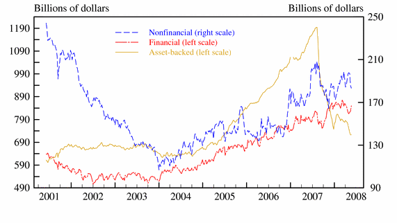
However, notice that total asset-backed paper is still dropping right now:
And while the Ted Spread has dropped, it's still pretty high:
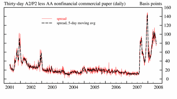
And while 1-month libor is coming in a bit, 3-month libor is still wide indicating the short-term market still has some problems.
Tuesday, May 27, 2008
Today's Markets
At least oil finally dropped in price as did rice. But, so did home prices and consumer sentiment. And thrifts set aside $7.6 billion in loan loss reserves in the first quarter.
I'm going to look at the charts a bit backwards today. First, remember the QQQQs have been the market leader for the this rally.
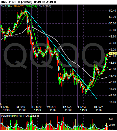
That's why today's action is so important. The QQQQs showed some life. Note they closed near their session highs.
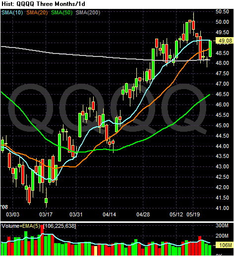
On the daily chart, notice the index bounced off the 200 day SMA -- a very important technical development. Also note that prices are right at the 10 day SMA. If they move through that level we could see a further rally.
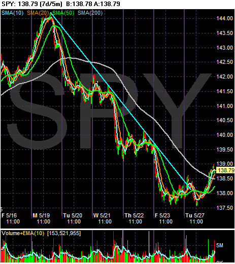
The SPYs followed suit. Notice the possible double bottom with the first bottom on Friday and the second bottom today.
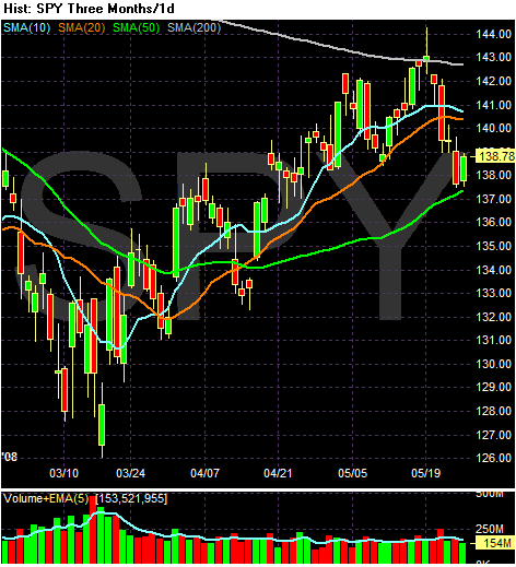
On the daily chart, notice the SPYs are consolidating right above the 50 day SMA. But also note the 10 day SMA is starting to move a bit lower.
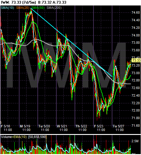
The IWMs also gained today.
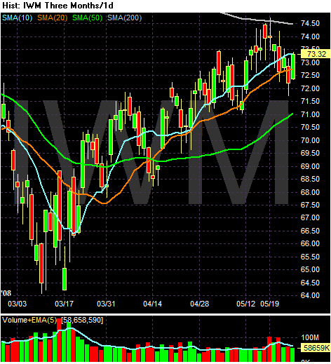
And notice they moved through the 20 day SMA are are trading right at the 10 day SMA.
I'm going to look at the charts a bit backwards today. First, remember the QQQQs have been the market leader for the this rally.

That's why today's action is so important. The QQQQs showed some life. Note they closed near their session highs.

On the daily chart, notice the index bounced off the 200 day SMA -- a very important technical development. Also note that prices are right at the 10 day SMA. If they move through that level we could see a further rally.

The SPYs followed suit. Notice the possible double bottom with the first bottom on Friday and the second bottom today.

On the daily chart, notice the SPYs are consolidating right above the 50 day SMA. But also note the 10 day SMA is starting to move a bit lower.

The IWMs also gained today.

And notice they moved through the 20 day SMA are are trading right at the 10 day SMA.