Wednesday, October 7, 2009


What do you see on that chart. Nothing? Well that's about the size of the action. The markets moved sideways. The good news is there was a rally in the last hour of trading on increasing volume. That could be a good sing for tomorrow. But at the same time there was a lack of follow-through from yesterday's rise that is concerning. We had the same situation last week (lack of follow-through on Tuesday) and the rest of the week was terrible.


The markets have moved nicely from the 50 day EMA. Also note the MACD is about to cross the signal line.

S&P 500, DJIA close ***UP*** year-over-year

A quick note in addition to whatever Bonddad posts about today's markets.

Today, for the first time since the beginning of the recession, the Standard and Poor's 500 Index, as well as the Dow Jones Industrial Average, closed UP on a year over year basis.

One year ago today, the S&P 500 closed at 996.23. Today it closed at 1057.58. One year ago today, the Dow Jones Industrials closed at 9447.11. Today the DJIA closed at 9725.58.

Incidentally, this is something that never happened during the 1929-32 "great contraction."

Notes on Job Losses during the Great Recession

Last week Calculated Risk posted a summary of a New York Times opinion piece by David Leonhardt in which he argued that:


In the job market, at least, the recession’s pain has been unusually concentrated. ... People who have lost their jobs are struggling terribly to find new ones. Since the downturn began in 2007, companies have been extremely reluctant to hire new workers, and few new companies have started. The economy and the job market are churning very slowly....

Try thinking of it this way: All of the unemployed people in the country are gathered in a huge gymnasium that’s been turned into a job search center. The fact that this recession is the worst in a generation means that there are many, many people in the gym. The fact that the economy is churning so slowly means that there is not much traffic into and out of the gym.

If you’re inside, you will have a hard time getting out. Yet if you’re lucky enough to be outside the gym, you will probably be able to stay there. The consequences of a job loss are terribly high, but — given that the unemployment rate is almost 10 percent — the odds of job loss are surprisingly low.

To the contrary, I think Leonhardt has it almost exactly wrong: not only are people who have lost their jobs are finding it very hard to find new ones, with the attendant terribly high consequences for the individual, their families, and for the economy generally; but also what is starkly different about this recession has been exactly the breadth as well as the depth of job losses.

First, let's look at a historical graph of the US job market.


Viewed on a long-term basis, we can see that since World War 2, the number of American manufacturing jobs has stagnated, while service jobs have grown sixfold!

The total number of manufacturing jobs peaked in 1979 and has been in almost relentless decline ever since. The last decade -- even during the dreadfully lackluster "Bush expansion" -- has been particularly devastating:


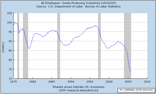
Over 25% of all manufacturing jobs have now been lost. Although I haven't shown an even longer-term graph, in fact there are now fewer manufacturing jobs in the US than there were during the time of "Rosie the Riveter" during World War 2.

Contra Leonhardt, the "surprise" in this recession isn't how concentrated job losses have been, but how general. There truly was a dramatic difference this time. In all prior post-WW2 recessions, it was manufacturing and general goods producing that bore the brunt of job losses. Services were barely touched.

For example, here is the 1981-82 recession (expressed as a change in % of jobs from the manufacturing peak, where peak = 100):


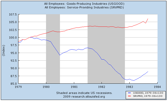
This is the recession that was responsible for 10%+ (U3) unemployment. The vast majority of those job losses were in goods producing jobs (in blue). Note that services (in red), relatively speaking, did not suffer much at all. While almost 15% of manufacturing jobs were lost, only about 1% of service jobs were affected.

The same was true of the 1991 Kuwait War recession and "jobless recovery", and the 2001-2 Tech Bust and 9/11 recession and "jobless recovery".

Not this time. This time, for the first time, services were every bit as hard hit as goods producing jobs. Here's a graph of total goods-producing vs. service jobs for the 1991, 2001, and "Great" recessions and "jobless recoveries":


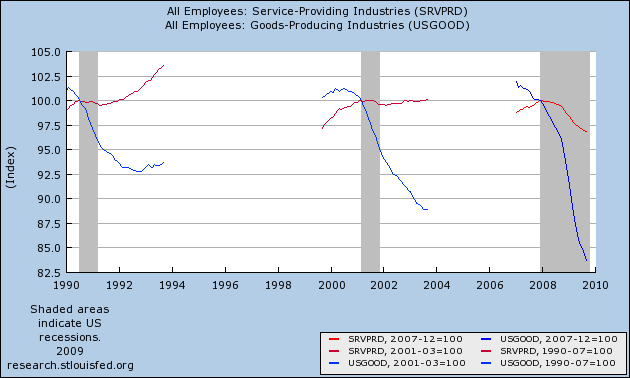
Again, notice that while manufacturing jobs were hard-hit in all recessions, service jobs were barely touched, with losses of only ~1%, in the prior two recessions. Not so this time. Since August 2008, almost 3% of all service jobs have been lost -- and remember that since service jobs are about 6x the number of manufacturing jobs, this is equivalent to 18% of manufacturing jobs being lost -- a staggering amount!

Here's a chart, showing the same in terms of actual numbers of jobs lost: Note how dramatically the data from this recession sticks out.

MonthMfg # lostServices # lost


1979-82*3.6M 0.3M


1990-912.1M 0.4M


2001-033.0M 0.5M


12/2007-8/20080.6M 0.4M


8/2008-9/20092.9M 3.2M!

[*Services measured from 10/80 peak. M = million]

Additionally, it is not so clear that those who haven't lost jobs need to have no fear of losing theirs henceforth.

Lenhardt observes that "if you’re lucky enough to be outside the gym, you will probably be able to stay there." True enough, but the chances of losing one's job even now are much more than trivial. Even if we accept that we are already out of the Recession in GDP terms, and even if we accept for purposes of this argument that the economy may yet start to actually add jobs before next year, at minimum there will probably be 250,000-750,000 more net job losses first. During that same period of time, as we know form weekly new unemployment claims, about 500,000-550,000 jobs will be lost per week. That's a total of something like 6 million (525,000 x 13 weeks) newly unemployed between now and the end of the year, counterbalanced by 5.5 million new jobs, for a net loss economy-wide of 500,000 by year-end. Since there are about 120 million employed, 6 million pink slips amounts to 5% of the workforce (note this % is for losses only, and does not count new jobs added). Those are non-trivial odds of currently employed people entering Leonhardt's "gymansium."

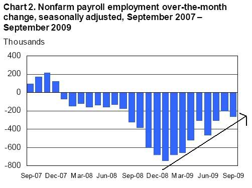
Finally, some notes in response to last Friday's abysmal jobs report. First of all, did I mention it was abysmal? It was, and for all the reasons spelled out by Invictus and others. Like Bonddad, however, I am impressed by the broad array of signs that indicate we have at least taken the first halting steps in economic expansion. That both ISM manufacturing and non-manufacturing surveys both show expansion for the first time since the recession began is particularly noteworthy, in addition to two months' straight of increased industrial production. That makes it all the more stunning that an expanding economy could nevertheless shed a quarter million jobs.

That being said, a graph breaking down the number of unemployed by weeks out of work, shows the exact same pattern as for all prior recessions and recoveries:


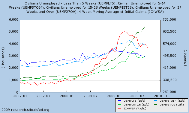
The graph above shows that initial jobless claims (red), unemployment for under 5 weeks (blue) and unemployment for 5-14 weeks (light green) have all likely peaked and are not "false dawns." Longer term unemployment continues to grow.

To use an analogy, suppose there has been a bad traffic accident on an expressway during rush hour. Several lanes of traffic are closed, but then as the accident is cleared away, lanes open up. Traffic at fist is at a near dead halt, and more and more traffic gets stuck in the rear of the jam. As lanes are cleared, more traffic leaves the front of the traffic jam, but more still continues to be added to the rear, increasing the total number of cars at a standstill. Eventually more traffic leaves than enters before the jam dissipates.

The above graph shows that the front of the traffic jam is able to leave at an increasing rate, but there is still on net more traffic entering the rear of the jam.

So, why the huge continuing job losses? Here's my best take. In the first place, 61,000 of the jobs lost in September were in government. While Invictus correctly points out that they consume just as much as anybody else, the fact is that job losses in government have historically come very late into recessions, or even months into the recoveries thereafter (as in, e.g., the three previous recessions.

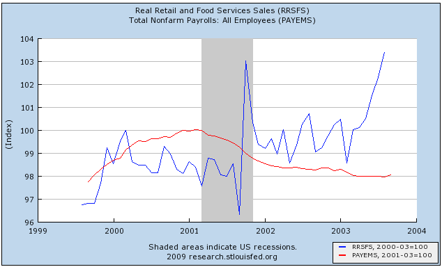
More disturbing is the 38,000 loss of retail jobs. As I have previously noted, most bloggers have it exactly backwards. Jobs don't lead consumption; historically consumption leads jobs. In the mild 2001 recession, consumption (real retail sales, in blue) barely flinched, and picked up soon enough that jobs (in red) were not lost beyond the same percentage as retail sales had declined:


In the "Great Recession," real retail sales have declined 10%, but service jobs have only declined about 5%:


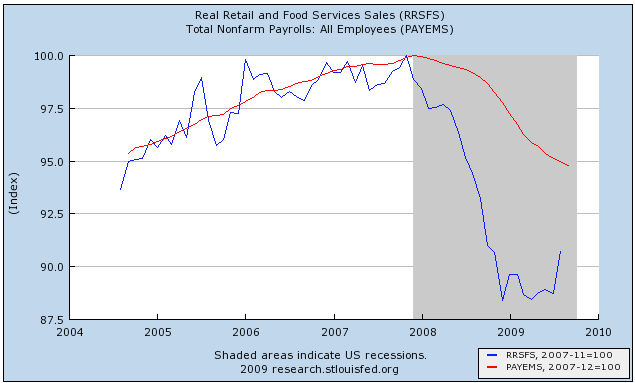
While employers have been quick to cut jobs and slow to rehire, the fact is, do they really need 95% of the previous workforce to sell 90% of the previous number of goods? No, and eventually if sales don't pick up, that is what we might get. (Note per my recent analysis of jobs, I do believe that sales will in fact pick up).

To put this in final perspective, here is a graph I prepared in connection with a previous post about Okun's law, to the effect that it requires 2% year over year growth in GDP to create a single new American job:


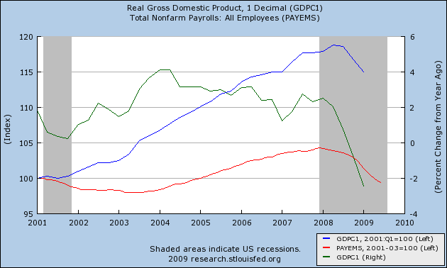
Note that when GDP briefly hit 2% YoY in mid-2002, there was a brief gain in payrolls, as well as the more sustained growth beginning in 2003. To get to 2% GDP growth for calendar year 2009, we need about 2.3% growth in each of the third and fourth quarters. Most analysts believe we will get that growth, at least in the third quarter. As to the fourth quarter, we will see.

Tax Credit For Employment Gains?

From the NY Times:

The idea of a tax credit for companies that create new jobs, something the federal government has not tried since the 1970s, is gaining support among economists and Washington officials grappling with the highest unemployment in a generation.

.....

One version of the approach, to be unveiled next week by the Economic Policy Institute, a labor-oriented research organization, would give employers a two-year tax credit if they increased the size of their work force or added significant hours of work (for example, making a part-time worker full time). Employers would receive a credit worth twice the first-year payroll tax for each new hire, amounting to several thousand dollars, depending on the new worker’s salary.

...

[a second proposal would be] a credit in the first year ... equal to 15.3 percent of the cost of adding an employee. In the second year, it would fall to about 10.2 percent.

For example, hiring a worker might cost a small business $50,000 annually. But with the tax credit, the cost would fall to $42,350 in the first year, and then be $44,900 the next year. After that, the cost would return to $50,000.

The credit would apply only to the portion of an employee’s salary under $106,800. Lowering the cap further, however, could provide an even greater benefit to low-wage, unskilled workers.


First, if this gets passed expect anyone who argued for any government stimulus to now argue these aren't real jobs and shouldn't be counted.

Seriously -- this is a good idea and should be done ASAP.

Wednesday Commodities Round-Up


Click for a larger image

A.) There is a lot of supply in the 40-41 area.

B.) Prices have found support at previously established price levels

C.) Momentum is decreasing, but notice that prices aren't crashing.

Bottom line: so far, it looks as though copper is holding its own.


Click for a larger image

The industrial metals chart has the following points.

A.) Prices have been in an upward trend line since mid-February.

B.) Prices consolidated in April and May in a triangle pattern

C.) Prices consolidated in June and July in a pennant pattern

D.) Prices consolidated in August and September in a pennant pattern

E.) Momentum has decreased but prices have simply consolidated to the trend line.

Tuesday, October 6, 2009

Today's Markets


Click for a larger image

A. ) Prices opened higher on good volume.

B.) Prices hit resistance where the rounding top should have ended. But

C.) Prices moved higher on stronger volume.

ISM Non_Manufacturing Shows Growth


Note the index has been increasing since October -- that's almost a years worth of increases. In other words, there is a strong trend to this particular index.

Here is a link to the report.

The report always has representative quotes from various industries that show underlying trends. Here are the quotes from the latest report:

  • "Sales are very steady and have risen some each month in the past six months. The bottom is now here." (Construction)
  • "Economic recovery turnaround has begun in the financial services sector; however, cautious expense management is still practiced." (Finance & Insurance)
  • "Lack of capital available for new project development." (Accommodation & Food Services)
  • "Continue to see signs of slow recovery, but customers are still putting orders off until the beginning of 2010." (Professional, Scientific & Technical Services)
  • "Inconsistent ... just when things seem to be settling a bit, a new set of pressures develops." (Retail Trade)
  • "Improvements seen in prices available for natural gas and other fuels." (Educational Services)

Construction, professional and financial service quotes are consistent with an improving picture. Retail is showing problems, but that is to be expected. We're also seeing signs that banks are still reluctant to make loans right now.

This is another piece of data that shows the economy is coming out of the recession.

A commenter made a good point regarding word choice. The index has printed a positive number for the first time in a year. I used the word "increasing" to describe the path of the index. A better word choice would have been something like "decreasing at a slower rate."

The Jobs Report and The Argument for Recovery

Friday's jobs report was a stunner -- and for all the wrong reasons. The consensus was for a decrease of roughly 175,000. This would have been consistent with a slow and gradual decline in the rate of job loss since the beginning of the year and would have been a positive development. Instead the number printed at -263,000. This means that for the last 5 months the economy has not printed a jobs number below a loss of 200,000. Simply put, that number is deeply concerning. However, has that number -- or more specifically has the last 5 months of jobs numbers -- destroyed the recovery?

First, let's look at why economists are talking about a recovery in the first place.

1.) The Philadelphia Fed's manufacturing index has been rising since just after the first of the year,

2.) ...as has New York's Empire State Index.

3.) The Richmond Fed's Manufacturing Index is now in positive territory

4.) ... as is the ISM Manufacturing Index.

5.) Industrial Production appears to have bottomed, printing two consecutive months of increases,

6.) ... along with two months of increases in capacity utilization.

7.) The rate of decline in durable goods orders has bottomed.

So -- we have seven different indicators that say the worst is over for the manufacturing sector. The regional fed surveys and the ISM have all climbed from incredibly low levels to show expansion.

8.) The index of leading economic indicators has
increased strongly for the last 5 months.

9.) The threat of deflation -- which was one of the primary reasons for the massive stimulus plan -- is not an issue.

This is extremely important. The threat of deflation was one of the primary reasons for the stimulus spending. Deflation is what led to the great depression. Here's what happens. Consumers stop spending. Retailers lower their prices to attract buyers. This lowers retailers profit margins leading to more lay-offs. Lower sales means lower production of consumer goods which leads to more lay-offs. This lowers consumer demand and the process repeats itself. However, now there is moderate inflation. That indicates that somewhere in the economy there is enough demand pull or cost push from somewhere to increase prices.

10.) The credit markets have stabilized.

11.) The yield curve is showing expansion.

12.) The corporate and junk bond markets have rallied indicating a return of investor's risk appetite.

13.) The housing market appears to have stabilized.

14.) The pace of retail sales bottomed at the beginning of the year

15.) ... as did personal consumption expenditures.

16.) While the pollster.com's average of "is the economy getting better/getting worse" still shows more people thing the economy is getting worse, the percentages have been consistently increasing since March of this year.

17.) Commodity prices have increased (see charts for copper and industrial metals)

18.) Semi-conductor sales have increased for 6 straight months.

19.) Other economies have started to show growth.

20.) Rail traffic has increased on a the month to month basis.

21.) The stock market has rallied about 50%.

22.) The IPO market is starting to thaw.

23.) The M&A market is starting to show some life.

24.) The ISM services index is now positive.

In other words, there are numerous reasons to argue the economy has bottomed and is on the mend. In addition, there are some incredibly healthy developments in the list above. Consider the increase in inflation which indicates that pricing power exists at some point in the economy. Then there is the healing of the credit markets as demonstrated by the a2/p2 spread or the stabilization in both new and existing home sales.

Let's add one important factor to this discussion. Unemployment is a lagging indicator -- in decreases after the economy turns around. In other words, we're not in a position to even consider a decreasing unemployment rate yet.

Then there is the jobs situation, which is still the one main sticking point to a full-blown recovery. Let's take a look at the data to see where we are:


The above chart tells us the economy has yet to print a job loss of less than 200,000 -- a troubling sign. However, in the latest employment report, the BLS also told us they revised the total number of jobs lost during the recession lower by an additional 800,000+ thousand. That means that instead of coming down from a period where the economy lost 600,000/month at the end of last year and the beginning of this year, the rate of decline was even sharper. That indicates we're coming up from a deeper hole meaning an even longer recovery period then previously thought. Note that I have continually said about those who are arguing based solely on the jobs issue: an economy that losses over 2 million jobs in 4 months is not going to print a positive employment number anytime within the next 9-12 months." Now we know we are coming from a deeper hole.

My position on the jobs situation relative to the economy has changed to "I have no idea right now." When the jobs report first came out, I was extremely disappointed because the rate of decline failed to drop below 200,000. However, I did not consider completely the balance of information -- that is, considering the amount of news indicating the economy has bottomed verses the jobs situation. The reality is there are numerous data points that indicate we've reached bottom. It's not just one number. Consider: manufacturing is growing, housing sales have bottomed, consumer spending has bottomed, other economies are growing, the credit markets have healed, commodities are rallying, risk appetite has returned, semiconductor sales have increased, rail traffic is increasing. If it were one data point versus the jobs report, it would be a no brainer. But it's not. We have a ton of information pointing to a bottom and nascent recovery. In addition, the downward revision of the total jobs lost for this recession tells us we're digging out from an even deeper hole than before. That logically lengthens the time required to get back to a time of jobs creation. And finally, there is the issue of unemployment which is a lagging indicator. That means we shouldn't even be talking about the drop in the unemployment rate yet.

In short, when I figure it out I will let you know.

Treasury Tuesday's


A.) There is a long term trend line in place that goes back to mid-2007.

B.) There are secondary trend lines in place that go back to 2008.

C.) The MACD has given a buy signal

D.) Prices are strengthening relative to recent levels


A.) An upward trend line started in early August

B.) Prices moved through key resistance levels by gapping up on strong volume. This is about the strongest move an issue can make.

Notice the EMA orientation -- all the EMAs are moving higher, the shorter EMAs are above the longer EMAs and prices are above all the EMAs.

This is a very bullish chart.

Monday, October 5, 2009

Today's Markets


Click for a larger image.

A.) Prices opened higher on strong volume but couldn't maintain the upward momentum. Prices fell to the 50 minute EMA.

B.) Prices get just beyond the 200 minute EMA and then fall back in a downward sloping pennant pattern. Prices find support at the 20 minute EMA.

C.) Prices move through the 200 minute EMA and then consolidate sideways eventually finding support at the upward sloping trendline.

D.) Prices move through resistance on a volume spike, rally a bit and then move lower in a disciplined, downward sloping channel.

September Leading Indicators

- by New Deal democrat

Despite the rotten payroll and other numbers last week, it looks like the September Index of Leading Economic Indicators will print positive, for the 6th positive month in a row. The 10 indicators, with the weights given each indicator, are as follows:

- real money supply (35%)
- average weekly manufacturing hours (25%)
- interest rate spread (10%)
- manufacturers' new orders for consumer goods (8%)
- supplier deliveries (7%)
- stock prices (4%)
- consumer expectations (3%)
- building permits (3%)
- average weekly initial claims for unemployment insurance (inverted) (3%)
- manufacturers' new orders for durable goods (2%)

Here's my estimate of how each fared for September. The 7 positives were:

The yield curve is still positive, although slightly less so: +.30
Consumer nondurables up: +.06*
ISM deliveries up slightly +.03
Stocks' 3 month gain is worth +.05
Consumer sentiment adds +.20
Housing permits are worth about +.02
Initial jobless claims were much better:+.15

The 3 negatives were:

Real M2* has been trending slightly negative, so -.02
Aggregate hours in manufacturing down: -.06
Durable goods' plummeted: -0.10*

*These will be used to revise August and estimate September.

Bottom line: it looks like September Leading Economic Indicators (and revisions to August) will net about +0.6, the sixth positive reading in a row. For the last 6 months, LEI will be up ~5.2. Year-over-Year, LEI will be up ~2.5.

Redefining the Phrase "Jobless Recovery"

The first use I can find in the NY Times of the phrase “jobless recovery” comes from an article dated October 12, 1991. Some – emphasis on that word – of the similarities between then and now are striking:

"The consumer did come out of the closet in the spring," said Nicholas Perna, chief economist at the Connecticut National Bank. "The problem is that they ran straight into a jobless recovery."

The economy has generated just 224,000 jobs since April. Many large companies as well as state and local governments continue to announce cost-cutting measures that include layoffs, and few executives expect the kind of rip-roaring job growth that followed the deep 1981-82 recession.

"The growth in the economy has come mostly from rising productivity, not new jobs," Mr. Perna said.

That has kept consumers who have held on to their jobs feeling anxious. Confidence surged in March after the Persian Gulf war ended but "has been moving sideways ever since," said Richard Curtin, director of the Consumer Survey Research Center at the University of Michigan.

Lacking the Cash

And incomes, which have been inching up, have not recovered from the recession yet. On average, each American consumer lost about $450 in after-tax income in the recession and has recouped just $100 of that loss, according to David Kelly, an economist at Data Resources Inc. "The glass is just one-quarter full," he said.

So far, consumers have been squeezing their savings, freeing up ready money by paying off debt, and benefiting from lower inflation. But spending cannot continue to climb much faster than income for long. So with job growth likely to stay anemic, Mr. Kelly said he expected consumer spending to rise at just a 2 percent rate in the fall.


Employment peaked in June 1990 at 109,817,000. It troughed 11 months later at 108,196,000, for a loss of 1.6 million jobs. It returned to the previous peak 21 months later, in February 1993, when it hit 109,967,000. In other words, it took 32 months from start to finish to re-attain the previous peak.

Fast forward to the 2001 jobless recovery. Employment peaked in February 2001 at 132,530,000. We then did a slow bleed for some 30 months, hitting a trough in August 2003 at 129,822,000, for a loss of 2.7 million jobs. 18 months after that, in February 2005, we re-attained the previous peak as we got back to 132,720,000. All in, reaching the previous peak took some 48 months, making the last recession’s recovery even more jobless.

As of last Friday’s jobs report, we have now lost some 7.2 million jobs since the peak in employment that we hit in December 2007. We’re now 22 months in and still losing 263,000 jobs/month.

Via FRED, I have taken the average jobs numbers for the previous two “jobless” recoveries and overlaid our current recession. In addition, I have added an employment forecast provided by a friend who works as an economist at one of the country’s Federal Reserve Banks (frankly, I think he’s a bit optimistic, but we’ll go with it for now). Here’s what we see (click for larger image):


This chart scares me. (Lots of charts I make scare me; I don't know why I keep making them.)

The first thing that jumps out at me is how severely the labor market is contracting relative to the last two recessions. Second, though I think my Fed friend is a good economist, I do have a hard time buying into his forecast, which essentially calls for positive NFP prints starting next month and continuing for the next 14 months (and beyond).

Now, 36 months takes us to December 2010, at which point we will still be woefully behind the average jobs recovery of the last two recessions. I'd guess we'll still be behind the eight ball in December 2011, fully 48 months after the onset of the recession.

On a very related note, there was nothing -- nada, zilch -- in last week's employment report that hinted of recovery in the labor market. The headline number was worse than expected. Had a number of folks not dropped out of the labor market, the unemployment rate would have breached 10%. The most all-inclusive measure of labor market weakness -- the U-6 report -- climbed from 16.8% to another new record, 17%. And it's hard for me to buy into the argument that the report wasn't as bad as it looked because 53,000 of the jobs lost were government employees. Do those folks not shop? Not have to put food on the table, gas in the car, pay the mortgage?

And I'd be remiss if I didn't point out that in last Friday's release, the BLS announced wholesale backward-revisions:

"The preliminary estimate of the benchmark revision indicates a downward adjustment to March 2009 total nonfarm employment of 824,000 (0.6 percent)."

That's 824,000 more jobs lost than the 7.2 million we've alredy recorded, meaning that when these revisions are incorporated in a few months, the total for the period will be over 8 million, making the chart above all the more scary. Barry Ritholtz has more on the farce that is otherwise known as the Birth/Death adjustment.

On another related note, the Wall St. Journal reported on Friday:

Consumer bankruptcies topped one million for the first nine months of this year, the highest point since the system was overhauled in 2005.[...]

"Bankruptcy filings continue to climb as consumers look to shelter themselves from the effects of rising unemployment rates and housing debt," the institute's Executive Director Samuel J. Gerdano said.


My ongoing fear is that any semblance of recovery is going to be very elusive absent the participation of the consumer.

I've not seen a green shoot in a while, and I'm becoming fearful now that Cash for Clunkers is gone, the first-time homebuyer credit is going to (possibly) expire, and we got a scrape-along-the-bottom series of non-Armaggedon-like numbers, we've got nowhere to go. The stock market may -- stress "may" -- have also come to that realization over these past couple of weeks. It would appear the burden may have shifted to the green-shooters for now.

Market Mondays

Let's take a look at last week's market action. Click on all images for a larger image


First, on the long term chart, notice that (A) prices have broken through a long-term trend line that started in March.


Prices have also moved through the trend line started in early July.


A.) Prices hit the 50 day EMA and bounced higher. This is also the same price level established at a high point in August.

B.) The 10 day EMA is about to move through the 20 day EMA. This is not fatal as it is a short-term trend.


A.) Prices did not follow-through (move higher) after a strong showing on Monday.

B.) Prices dropped hard on high volume but rebounded. However,

C.) Prices moved through the same trend line again later in the day on high volume.

D.) As prices moved lower they continued to consolidate gains in upward sloping pennant patterns.

E.) On Friday, notice that prices had a slight upward bias. However, this can be seen as a long, upward sloping consolidation pattern on the way lower.

Friday, October 2, 2009

Weekend ... Pitbull


It's that time of the week again. And again -- here is Max (yes we named him). He is really sweet. He rolls over on his belly for scratches and licks faces. And he is still looking for a home or foster. So if you are interested, please leave a post in the comments.

See you on Monday.

More On the Unemployment Numbers

Let's take a deeper look into the data to see what's there. Click for a larger image.


The number of people unemployed less than 5 weeks is still decreasing.


The number of people unemployed for 5-14 weeks decreased a bit but is still high. My guess here is that we'll see this number in the above range as people who are unemployed for less than 5 weeks don't find work.


The number unemployed 15 weeks and longer edged up.


The median weeks on unemployment increased but is still below the high of the cycle.

What I find interesting is the short end of the unemployment cycle -- people unemployed for less than 5 weeks -- continues to drop and has been dropping since the beginning of the year.

Payrolls Drop 263,000; Unemployment Increases to 9.8%

From the BLS:

Nonfarm payroll employment continued to decline in September (-263,000), and the unemployment rate (9.8 percent) continued to trend up, the U.S. Bureau of Labor Statistics reported today. The largest job losses were in construction, manufacturing, retail trade, and government.


I had thought that we could continue to see a decline in the number of job losses. However, that obviously did not happen.

CBS Marketwatch summed the report up:

Details of the report were almost universally dismal, with the number of unemployed people rising by 214,000 to 15.1 million. Of those, 5.4 million have been out of work longer than six months, accounting for a record 35.6% of the jobless. The employment participation rate fell to 65.2%.

An alternative gauge of unemployment, which includes discouraged workers and those forced to work part-time, rose to 17% from 16.8%.

Total hours worked in the economy fell by 0.5%. The average workweek fell back to an all-time low of 33 hours. Average hourly earnings rose just 1 cent, or 0.1%, to $18.67. Average hourly earnings are up 2.5% in the past year.

Let's look at a few points from within the report:


Click for a larger image.

The overall trend in the rate of job losses from the beginning of this year is still lower. Also note we had the same situation in June when losses spiked only to move lower the next month.

Secondly,


The rate of job losses in three job categories is near 0. Oddly, the government lost 53,000 workers. That number seems a bit odd during the middle of a stimulus program.

All that being said, this is a clear step in the wrong direction. Considering the rate of job losses at the beginning of the year (600,000+/month) expecting an immaculate recovery is highly unrealistic. However, the bleeding has to stop at some point. So by the end of this year we have to be far lower than today's number for a recovery to be viable. Consumers cannot continue to hear news like this and expect to have a positive attitude about the economy. It's that simple.

Markets Are In Sell-Off Posture

Usually I do a "Forex Friday" here. However, there are important technical developments in the markets.

Consider the following charts:


A.) The DIAs have moved through one key support line and are approaching another. This has occurred on high volume.


A.) The IWMs have moved through one key trend line and are approaching another on high volume.


A.) The QQQQ have moved through key support on high volume. In addition, the QQQQs were one of the primary reasons for the rally over the last 3-6 months.


A.) Prices of the transports have sold-off through two key trend lines on high volume.


A.) On both the bond charts notice that prices have moved about key resistance lines on strong volume. This indicates that money is looking for more safety right now.

Thursday, October 1, 2009

Today's Markets


Click for a larger image

A.) Prices gapped lower at the open

B.) Prices tried to rally but ran into resistance at the 10 minute EMA

C.) Prices again tried to rally but ran into resistance at the 20 minute EMA

D.) Prices again tried to rally but they couldn't move beyond the 50 minute EMA.

E.) Prices moved lower at the end of the day on high volume


Click for a larger image

A.) Prices have moved through two trend lines and EMAs on high volume.

Let's do some basic math. Prices topped out at around 108. A 10% correction would take prices down to roughly 97.20. Here is a chart that shows important technical levels on the way down:

Challenger Job Cut Survey Drops


From Marketwatch:

Major U.S. corporations announced the fewest number of layoffs during September than at any time since March 2008, in a "sign of further job-market stabilization," according to a monthly tally compiled by outplacement firm Challenger Gray & Christmas.

Planned layoffs fell to 66,404 last month, down 13% compared with August and down 50% compared with September 2008.

For the third quarter, planned job reductions as tracked by Challenger Gray totaled 240,233, the fewest since the first quarter of 2008.

ISM Manufacturing, employment indexes stall in September

- by New Deal democrat

Previously I have that in the 1992 and 2002 recoveries, the ISM manufacturing index never rose above 53.6, in contrast to earlier recoveries where it quickly rose above 55 or even 60, and prepared a graph showing that an ISM reading of 53 or above strongly correlates with the economy adding jobs. Below that number the economy tends to shed jobs. In the graph, below, the low point for payrolls in each of the last 3 recessions (shown in red, green, and orange, respectively) is normed to 100. A reading of 103, for example, means 3 percent growth in payrolls from that low point. The ISM index is normed so that it crosses the 100 threshold at a reading of 53:


As of August, the index had surged to 52.9. September’s reading of 52.6 suggests that, unfortunately, just like the last two “jobless recoveries”, the index may again stall out at this level.

I have also noted that the employment sub-index compares the percentage of employers planning to hire, lay off, or keep current staffing levels in the next month. A reading above 50 indicates net hiring, and visa versa for a reading below 50. Two items of data in this index stand out very clearly as harbingers of or absolutely coincident with employment growth. First, whenever the hiring vs. firing index is -5 or higher (i.e., no more than 5% more employers plan to fire than hire) and rising, where other evidence indicates a recession is ending, that has always indicated net employment growth was imminent, at least on a temproary basis.Secondly, whenever current staffing intentions were 65+. and hiring plans were 15+, that has always coincided with positive jobs numbers in the BLS survey, including during and after the "jobless recoveries" of 1992 and 2002.

September’s employment index of the ISM deteriorated slightly from August’s. 15% of employers planned to hire, but only 62% held steady, and the net rating was -8.

Putting this together with the September jobless claims data, it appears that, while overall there may have been fewer jobs lost in September, that improvement was probably confined to the service sector of the economy. We’ll obviously find out much more tomorrow.

On the bright side, vendor deliveries slowed, meaning the Leading Indicator part of the ISM index improved.

A Closer Look At Personal Consumption Expenditures

Let's take a look at the latest Personal Income/Consumption Report from the BEA.

Here is a link to the report.

First, let's note some important percentages. By far, services comprise the largest segment of PCEs, representing 65.56% of total expenditures. Non-durable goods make up the second largest percentage at 21.90% and durable goods make up 12.54%. In other words, the cash for clunkers (C4C) impacted the smallest percentage of PCEs.

Here are the charts of the data:


Total real service expenditures have been increasing for the last three months. However, mind the scale of the right.


Spending on non-durables (goods that last less than three years) has been decreasing since March, but saw a big increase last month. There were two big events last month -- C4C and back to school shopping.


Real spending on durable goods was already increasing. C4C helped to spike the spending but it was already increasing at a slow rate.

What does this tell us?

1.) Note that on the chart of spending on services it appears that spending bottomed out in the earlier part of this year. As this is the largest percentage of PCEs this bottoming is a good development.

2.) Non-durables are still a wild-card.

3.) Real durables purchases were already increasing before the C4C and appear to have bottomed out as tell. The real question will be what happens over the next several months to this number.

M&A Activity Heating Up

If memory serves, the first big move was Disney buying Marvel. Aside from the obvious humor of Bambi now owning the Hulk, this deal makes a great deal of sense. Disney is a teen marketing powerhouse. Marvel now gives them a bigger reach in that market. Then there was Kraft going after Schepees - another decent move. We've started to see some in the drugs industry, and now we've learned of another merger this time in the tech field:

Cisco Systems on Thursday said it struck a $3 billion deal to buy Norway's Tandberg to bolster its position in video conferencing, though there's doubt in the market that the deal will be completed on these terms.

The bottom line is M&A activity has been increasing. This is a good sign for several reasons. The first is it indicates that companies are feeling a bit more secure about the future. When companies are nervous about the future they hoard cash. In addition, mergers take time to close and consolidate. This is better done when the economy is stagnant or growing rather than contracting.

Today the WSJ has an article titled M&A is Back! Well, Sort Of where they note that the number of deals is declining and is lower from year ago levels. However, they also note the following:


But unlike in recent quarters, deal makers seem more willing to declare that M&A activity is back. The standard banker line that "deals are in the pipeline" is becoming more common.

"I think we hit a bottom over the summer. Since about the third week of August, we noticed a pickup in activity," said Bruce Evans, head of M&A for the Americas at Deutsche Bank AG. "A lot is driven by companies having a view of the future....It is no longer just about fixing their balance sheets."

Kraft Foods Inc.'s proposal to acquire Cadbury PLC was the largest announced deal of the period, though Cadbury rejected the $16.66 billion bid and it is likely to be weeks before Kraft submits a formal offer. Other big deals included Abbott Laboratories' $7.05 billion purchase of a Belgian pharmaceutical business, Dell Inc.'s $3.88 billion acquisition of Perot Systems Corp. and Walt Disney Co.'s $3.92 billion deal to buy Marvel Entertainment Inc.

"With general sentiment improving, together with equity and financing markets, companies are pushing forward with deals they've been thinking about all year but were reluctant to proceed with until now," said Adrian Mee, head of European M&A at Nomura Holdings Inc. in London.


I think this is more of a perception/sentiment issue. There have simply been some larger far more public deals over the last few months compared to a year ago. And that is a good thing.

New Jobless Claims: 4 week average falls below 550,000

- by New Deal democrat

Initial jobless claims rose last week to 551,000. At September's end, the 4 week moving average was 548,000. This is the lowest average of the year, since January.

While it looks like the retail sales effect on unemployment claims of "cash for clunkers" is ebbing, of more interest is that this is the very first time that the 4 week average is more than 16% less than the April 4 peak of 658,750.

It is my hypothesis that when this average stays below the 16% level for 2-3 months, preferably falling to the 20% level for about a month (under 530,000), that will mark the point where the economy actually starts to add jobs.

Thursday Oil Market Round-Up


A.) Prices have broken the upward sloping trend line that started in March.


Click for a larger image. Ignore the last bar.

A.) Prices gapped down lower when they broke the trend.

B.) Prices then continued lower printed long bars on higher volume. This indicates the sell-off was strong; people were obviously had plans to get out of the oil market.

C.) As a result of the downward price action the EMAs are not more bearishly aligned. The shorter EMAs are below the longer EMAs. The 50 day EMA is getting pulled lower.

D.) Yesterday prices rebounded strongly on high volume.